Trading with (x) ticks charts: the hidden secret of successful traders
Many traders use time-based charts for their technical analysis but there is another way to display charts the (x) ticks view
What is the (x) ticks view?
A tick represents a transaction between a buyer and a seller at a given price and volume.
In the (x) ticks view each candlestick shows the price variation of x consecutive ticks.
In the example below, we are using a 3000 ticks view. Consequently, each candlestick shows the price variation of 3000 consecutive ticks.
What advantages do I get by using the (x) ticks view?
Let's look at an example.
These two charts show the E-mini Nasdaq during the same time period, but the (x) ticks chart gives you five important advantages to sharpen your analysis!
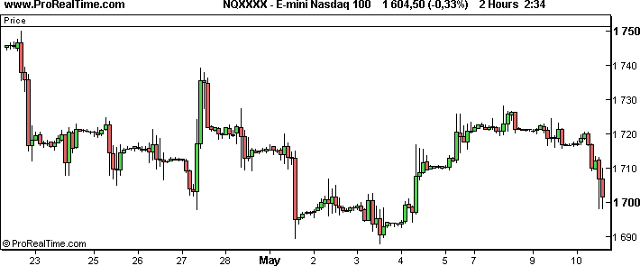
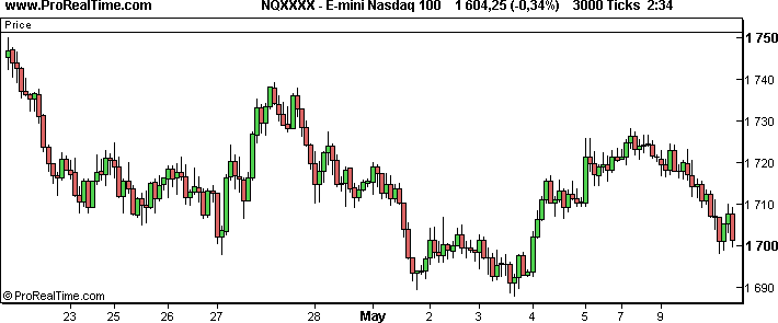
In few words, if you use the (x) ticks view in combination with the classic intraday time-based view, you can enrich your chart analysis with the following advantages, providing not only different, but also more accurate information:
- Clearer analysis
- Not time-based
- Confirmation of trendline breakouts
- Clearer signs when to exit the market
- Correlation between the volume and the price development
Clearer analysis
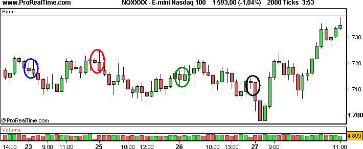
Let's zoom on the time period of April 23rd to April 27th and take a closer look at the candles.
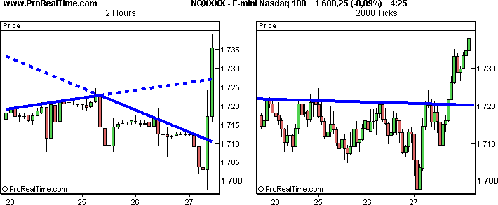
If the market is active, the classical view might sometimes not be "fast" enough. Sharp drops and increases of the price will be displayed as one large candle, even if you choose a rather small view like 1 minute. You find an example for this case in the image above.
You can see that in the 2 hour chart several small candles (common during the night) and several long candles (common during the day) are displayed. A trendline can be drawn between the 23th and the 25th, but will not indicate the trend change that takes place on the 25th and the 27th. You would actually need to draw two lines, which makes it even more difficult to decide where the trend might go.
In the (x) ticks view, the long candles are divided into smaller 2000-tick bars. A strong resistance line can be drawn from the 23rd until the 27th, which allows you to better understand the trend during these days.
Not time-based
We will keep looking at the same time period, but discuss another aspect of the candles in (x) ticks view.
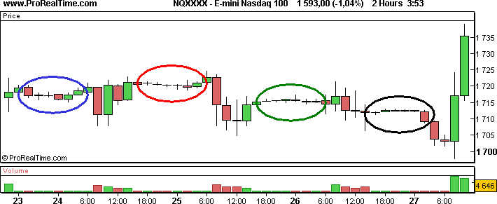
In times with only little buying and selling activity, like before the close of the market or around noon, the classic 2 hour view will show several unimportant candles that will give you no major information as you can see in the bottom chart of the example above.
On the other hand, the 2000 tick view displays only one or two candles during calm periods and avoids therefore an accumulation of small candles. This makes the detection of trends much easier, since a zero-trend environment in the time-based view can change your support and resistance lines drastically and consequently your trading decisions.
In the image below we coloured the odd days yellow and the even days white.
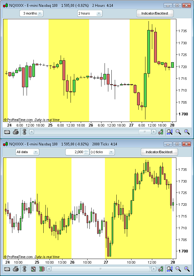
In the time-based view, each day has the same width.
That is not the case in the (x) ticks view, which shows more candles during days of high activity and less during days when the market is calm. For instance, on the 27th the (x) ticks view displays 32 candles while the day before it only displayed 16 candles.
Confirmation of trendline breakouts
As mentioned before, support and resistance lines can be very different in the two views. But what does that mean exactly?
See the E-mini Nasdaq 100 between April 23rd and May 10th. It is obviously a bearish market.
Let's imagine that we were trying to enter the market on May 4th if a bullish signal was confirmed.
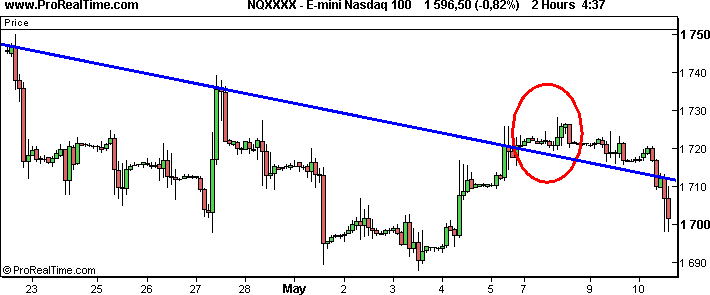
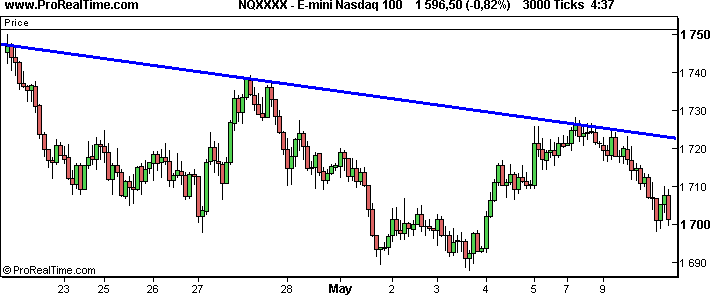
The image above shows a 2 hour chart and a 3000 tick chart, which display roughly the same amount of candles. If we draw the main resistance trendline on both charts, we see that there is a significant break of the trendline on May 5th on the 2 hour chart. Many market participants might go long, assuming that this is the start of a new bullish trend.
In the (x) ticks view, the trendline holds. If you had been looking at both charts, you would have most likely waited until you would have been able to detect a clear trend underneath or above the resistance trendline.
Your decision would have been different depending on the view you were working with.
Clearer signs when to exit the market
Imagine you are trading the Euro Bund Future in real-time, with the information we have on the 25th at 10:00 am on the chart below.
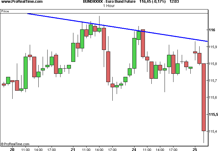
We assume that the trend will be bearish, so we sell at 10:16 am at the price of 115.55.
The 1 hour chart makes it impossible to identify where the trend will go or if it might change. The only thing we know, is that it was the right decision to sell.
So let's take a closer look at the chart by choosing a 1 minute view and 100 tick view as shown in the picture below.
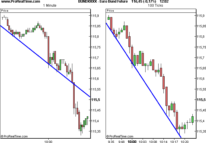
At around 10:00 am the Euro Bund Future drops. This drop, displayed as one long candle in the 1 minute chart, is divided into several smaller candles in the (x) ticks view: this allows you to draw a different support line compared to the one you get from the 1 minute view.
The 1 minute chart displays again one long candle at 10.15 am and breaks the support line. We sell and the market goes in the right direction for us.
A few minutes later, a trader that works with the 1 minute view only, is faced with two options: hoping that the price will fall further, without having any indication when and if the trend might turn, or to exit the market and wait for better times.
Unfortunately for this trader, both choices are only based on emotions. Imagine how frustrating it would be, if you had exited the market because you wanted to break even with your losses of the previous days, but the market actually falls much further. On the other hand, imagine how frustrating it would be, if you had kept the selling position and the trend changed and you lost the money you just earned.
As you can see, the chances of feeling frustrated at the end of the day are rather high!
Meanwhile, the fortunate trader that works with both views, can apply the results of his technical analysis to make his choice. For instance at 10:25 am he may decide to buy half of his selling position, because the price just touched the main support trendline. He would exit the market at right time and increase his profit.
Correlation between the volume and the price development
Another major advantage of the (x) ticks view is the usage of the volume.
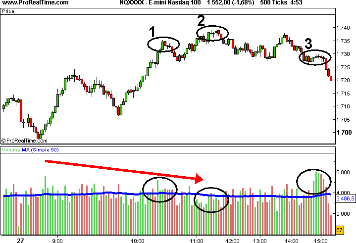
In the classic time-based view, the volume shows only the number of securities exchanged during a given period.
It will give you no indication if the security was bought or sold by major players or private investors.
However, in the (x) ticks view, each volume bar represents the number of securities exchanged per candlestick. Since the number of transactions per candlestick is constant, each volume bar reflects the average volume of all transactions of the corresponding candlestick. Let's see what that means in an example:
If you choose a 5 tick view, you could do the following calculation to find out about the value of the volume bar:
| Price of the first 5 transactions | Corresponding volume |
|---|---|
| 35,50 € | 1210 |
| 35,60 € | 840 |
| 35,60 € | 310 |
| 35,70 € | 243 |
| 35,60 € | 670 |
The volume bar of the corresponding candlestick would be the following in this case:
1210 + 840 + 310 + 243 + 670 = 3273
If you add the moving average to the volume chart (as the blue line in the example above) and the volume bar is taller than the moving average, you can assume that the transactions composing this bar were generated by a larger investors. These major players are generally more knowledgeable and about their investments than individual investors. In a trending market, this is often a sign of the continuation of the tred.
Experience shows that a new high, like at point 2 in the example above, accompanied by smaller volume bars than those of the previous high, like at point 1, indicates that the bullish trend may come to an end.
At point 3 on this chart, some major investors are sellers and some are buyers. This causes a stagnation in the short term and once the market decides to break the support, "small sellers" are active and make the price decrease.
Conclusion
In the past paragraphs we presented you the advantages of the (x) ticks view by comparing it to the classical time-based view.
The (x) ticks view shows many times a different chart than the time-based view during the same time period. This can help you when determining whether to go long, short, stay out of the market or even more important, exit your positions. In many cases the chart is clearer and helps you to apply technical analysis tools.